-
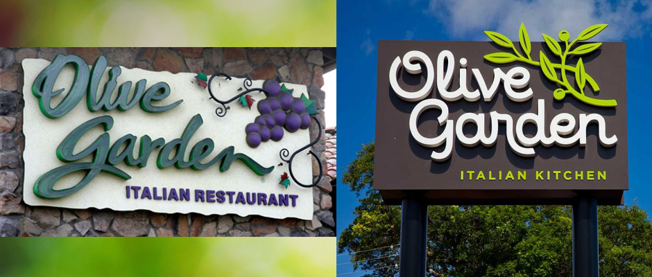
Olive Garden Logo Redesign – A Step in The Right Direction?
- 15 Jul, 2014
- nblair
- 0 Comments
If you liked Olive Garden’s ‘old country’ vibe then you might not like where the brand is going. Olive Garden, owned by parent company Darden, has undergone a rebranding to try and shed it’s feel of being a classic italian eatery and is now going for a more modern eclectic vibe. With abstract artwork on it’s walls and a push towards quicker in-and-out service for lunch, it hopes to regain customers that have been going elsewhere for lunch.
To read more about this rebranding, check out this article by BloombergBusinessweek. http://www.businessweek.com/articles/2014-07-09/olive-gardens-redesign-bids-farewell-to-fake-old-world-charm
I am personally a little sad seeing the rebranding and move away from the ‘old country’ feel. I always liked that about Olive Garden, being able to go in and and see some pictures of Italian countryside or old stone alleyways. I think their new logo and branding will grow on people, I just don’t think they will be able to capture the lunch crowd they want. Most people only have a half hour or an hour for lunch and you have to figure in driving time too. So in reality you might only have 20 – 30 minutes to dine in someplace. Although I’ve received some fast service from Olive Garden in the past, I don’t know if they will ever be consistently fast enough to draw in the weekday lunch crowd. Maybe I’m wrong though, I hope they can grow their business with this forward-thinking strategy.
What are your thoughts on the Olive Garden rebranding? Are you sad to see the ‘old country’ vibe go away?

Comments